Now we will learn how to add various elements to our plots.
Every plot in Matplotlib consists of various elements. If is shown extensively in the image below:
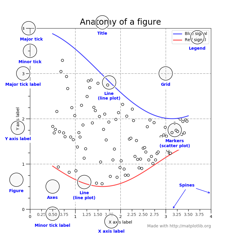
Note: The image, Anatomy of Figure, was obtained from the official Matplotlib website.
We will start by adding a title and axis labels to our plot. To add the title, we use the title method:
import numpy as np

X = np.array([1, 2, 5, 8, 12])
Y = np.array([3, 6, 7, 12, 9])

import matplotlib.pyplot as plt
plt.plot(X, Y)
plt.<< your code goes here >>("This is the title")
And, for the the axis labels, we use the xlabel and ylabel methods respectively:
plt.xlabel("X label")
plt.<< your code goes here >>("Y label")
Finally, we use show to display our plot:
plt.<< your code goes here >>
Note - Having trouble with the assessment engine? Follow the steps listed here

Loading comments...