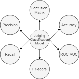
In this blog, we will discuss about commonly used classification metrics. We will be covering Accuracy Score, Confusion Matrix, Precision, Recall, F-Score, ROC-AUC and will then learn how to extend them to the multi-class classification. We will also discuss in which scenarios, which metric will be most suitable to use.
First let’s understand some important terms used throughout the blog-
True Positive (TP): When you predict an observation belongs to a class and it actually does belong to that class.
True Negative (TN): When you predict an observation does not belong to a class and it actually does not belong to that class.
False Positive (FP): When you predict an observation belongs to a class and it actually does not belong to that class.
False Negative(FN): When you predict an observation does not belong to a class and it actually does belong to that class.
All classification metrics work on these four terms. Let’s start understanding classification metrics-
Accuracy Score-
Classification Accuracy is what we usually mean, when we use the term accuracy. It is the ratio of number of correct predictions to the total number of input samples.

For binary classification, we can calculate accuracy in terms of positives and negatives using the below formula:
Accuracy=(TP+TN)/(TP+TN+FP+FN)
It works well only if there are equal number of samples belonging to each class. For example, consider that there are 98% samples of class A and 2% samples of class B in our training set. Then our model can easily get 98% training accuracy by simply predicting every training sample belonging to class A. When the same model is tested on a test set with 60% samples of class A and 40% samples of class B, then the test accuracy would drop down to 60%. Classification Accuracy is great, but gives us the false sense of achieving high accuracy.
So, you should use accuracy score only for class balanced data.
You can use it by-
from sklearn.metrics import accuracy_score
In sklearn, there is also balanced_accuracy_score which works for imbalanced class data. The balanced_accuracy_score function computes the balanced accuracy, which avoids inflated performance estimates on imbalanced datasets. It is the macro-average of recall scores per class or, equivalently, raw accuracy where each sample is weighted according to the inverse prevalence of its true class. Thus for balanced datasets, the score is equal to accuracy.

Confusion matrix-
A confusion matrix is a table that is often used to describe the performance of a classification model on a set of test data for which the true values are known.

It is extremely useful for measuring Recall, Precision, Specificity, Accuracy and most importantly AUC-ROC Curve.
from sklearn.metrics import confusion_matrix
Precision-
It is the ratio of the true positives and all the positives. It tells you that Out of all the positive classes we have predicted, how many are actually positive.

from sklearn.metrics import precision_score
Recall(True Positive Rate)-
It tells you that out of all the positive classes, how many we predicted correctly.
Recall should be as high as possible. Note that it is also called as sensitivity.

from sklearn.metrics import recall_score
F1-Score-
It is difficult to compare two models with low precision and high recall or vice versa. If you try to increase precision, then it may decrease recall and vice versa. So it ends up in a lot of confusion.
So to make them comparable, we use F1-Score . F1-score helps to measure Recall and Precision at the same time.

It uses Harmonic Mean in place of Arithmetic Mean by punishing the extreme values more.
from sklearn.metrics import f1_score
We use it when we have imbalanced class data. In most real-life classification problems, imbalanced class distribution exists and thus F1-score is a better metric to evaluate our model on than accuracy.
But it is Less interpretable. Precision and recall are more interpretable than f1-score, since precision measures the type-1 error and recall measures the type-2 error. However, f1-score measures the trade-off between these two. So, instead of working with both and confusing ourselves, we use f1-score.
Specificity(True Negative Rate): It tells you what fraction of all negative samples are correctly predicted as negative by the classifier.. To calculate specificity, use the following formula.

False Positive Rate : FPR tells us what proportion of the negative class got incorrectly classified by the classifier.

False Negative Rate: False Negative Rate (FNR) tells us what proportion of the positive class got incorrectly classified by the classifier.

See, If you know clearly what task you have to accomplish, then it’s better to use precision and recall over f1-score. For example, suppose government launched a scheme for free cancer detection. Now, it’s costly to perform a single test. So, government assigned you a task to build a machine learning model to identify if a person is having cancer. It will be an initial screening test as government will take predictions from your model and will test those persons which your model predicted to have cancer, with real machines that whether they really are having cancer or not. That will reduce the cost of the scheme to much a extent.
So in such case, it will be more important to identify all the persons having cancer because we can tolerate that a person not having cancer is detected to have cancer because after testing with real machines, the truth will prevail but we can’t tolerate a person having cancer been not detected cancer because that can cost a person his life. So, here you will use recall metric to check the performance of your model.
But, if you are working on such a task where both precision and recall are important equally, then you may use f1-score over precision and recall.
ROC-AUC curve-
Not only numerical metrics, we also have plot metrics like ROC(Receiver Characteristic Operator) and AUC(Area Under the Curve) curve.
AUC — ROC curve is a performance measurement for the classification problems at various threshold settings. This graph is plotted between true positive and false positive rates. The area under the curve (AUC) is the summary of this curve that tells about how good a model is when we talk about its ability to generalize.
If any model captures more AUC than other models then it is considered to be a good model among all others. So, we can conclude that more the AUC the better the model will be on classifying actual positive and actual negative.
- If the value of AUC comes as 1 then we can be assured that the model is perfect while classifying the positive class as positive and negative class as negative.
- If the value of AUC comes as 0, then the model is worst while classifying the same. The model will predict positive class as negative and negative class as positive.
- If the value is 0.5 then the model will struggle to differentiate between positive and negative classes. The predictions will be merely random.
- The desired range for value of AUC is 0.5-1.0 as then there will be more chance that our model will be able to differentiate positive class values from the negative class values.
Let’s take a predictive model for example. Say, we are building a logistic regression model to detect whether a person is having cancer or not. Suppose our model returns a prediction score of 0.8 for a particular patient, that means the patient is more likely to have cancer. For another patient, it returns prediction score of 0.2 that means the patient most likely doesn’t have cancer. But, what about a patient with a prediction score of 0.6?
In this scenario, we must define a classification threshold. By default, the logistic regression model assumes the classification threshold to be 0.5, that is all patients getting a prediction score of 0.5 or above are having cancer otherwise not. But note that thresholds are completely problem-dependent. In order to achieve the desired output, we can tune the threshold. But now the question is how do we tune the threshold?
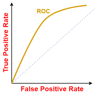
For different threshold values we will get different TPR and FPR. So, in order to visualize which threshold is best suited for the classifier we plot the ROC curve. A typical ROC curve looks like-
The ROC curve of a random classifier with the random performance level (as shown below) always shows a straight line. This random classifier ROC curve is considered to be the baseline for measuring the performance of a classifier. Two areas separated by this ROC curve indicates an estimation of the performance level — good or poor.
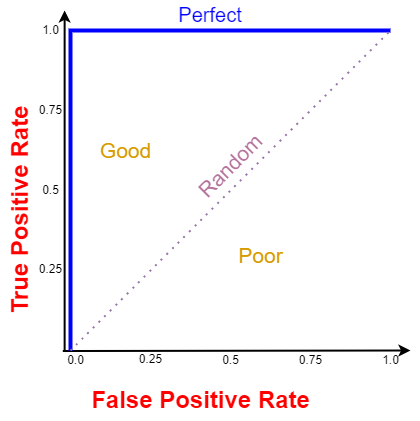
All ROC curves that fall under the area in the bottom-right corner indicate poor performance levels and are not desired whereas ROC curves that fall under the area in top-left corner indicate good performance level and are desired ones. The perfect ROC curve is denoted by the blue line.
Smaller values on the x-axis of the plot indicate lower false positives and higher true negatives. Larger values on the y-axis of the plot indicate higher true positives and lower false negatives.
Although the theoretical range of the AUC ROC curve score is between 0 and 1, the actual scores of meaningful classifiers are greater than 0.5, which is the AUC ROC curve score of a random classifier. The ROC curve shows the trade-off between Recall (or TPR) and specificity (1 — FPR).
from sklearn.metrics import roc_curve, auc
Sometimes, we replace the y-axis by precision and x-axis by recall. Then the plot is called as precision recall curve which does the same thing(calculates the value of precision and recall at different thresholds). But it is restricted only to binary classification in sklearn.
from sklearn.metrics import precision_recall_curve
Extending the above to multiclass classification-
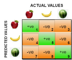
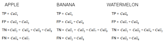
So in confusion matrix for multiclass classification, we don’t use TP,FP,FN and TN. We just use predicted classes on y-axis and actual classes on x-axis. In above figure, cell1 denotes how many classes were apple and actually predicted apple and cell2 denotes how many classes were banana but predicted as apple. In the same way cell8 denotes how many classes were banana but were predicted as watermelon.
The true positive, true negative, false positive and false negative for each class would be calculated by adding the cell values as follows:
Precision and recall scores and F-1 scores can also be defined in the multi-class setting. Here, the metrics can be “averaged” across all the classes in many possible ways. Some of them are:
- micro: Calculate metrics globally by counting the total number of times each class was correctly predicted and incorrectly predicted.
- macro: Calculate metrics for each “class” independently, and find their unweighted mean. This does not take label imbalance into account.
- None: Return the accuracy score for each class corresponding to each class.
ROC curves are typically used in binary classification to study the output of a classifier. To extend them, you have to convert your problem into binary by using OneVsAll approach, so you’ll have n_class number of ROC curves.
In sklearn there is also classification_report which gives summary of precision, recall and f1-score for each class. It also gives a parameter support which just tells the occurence of that class in the dataset.
from sklearn.metrics import classification_report